15 min 29 sec
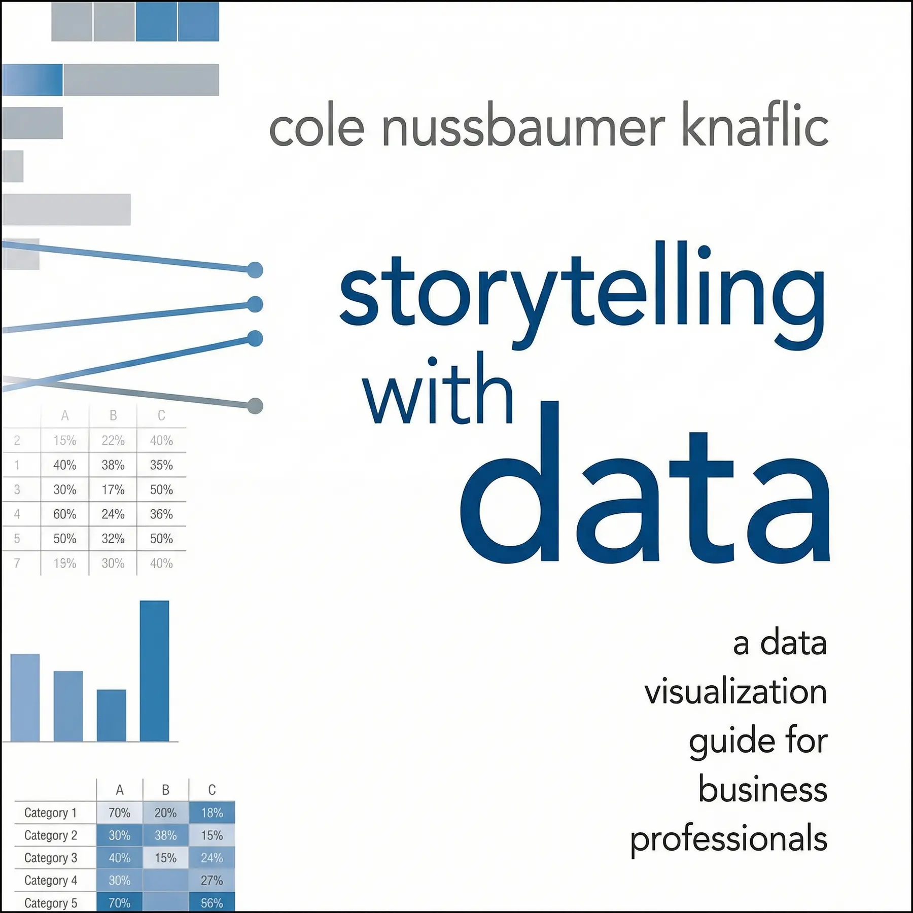
Storytelling with Data: A Data Visualization Guide for Business Professionals
By Cole Nussbaumer Knaflic
Storytelling with Data provides a masterclass in transforming dry numbers into persuasive narratives. It teaches business professionals how to eliminate clutter, focus audience attention, and use design principles to drive meaningful action.
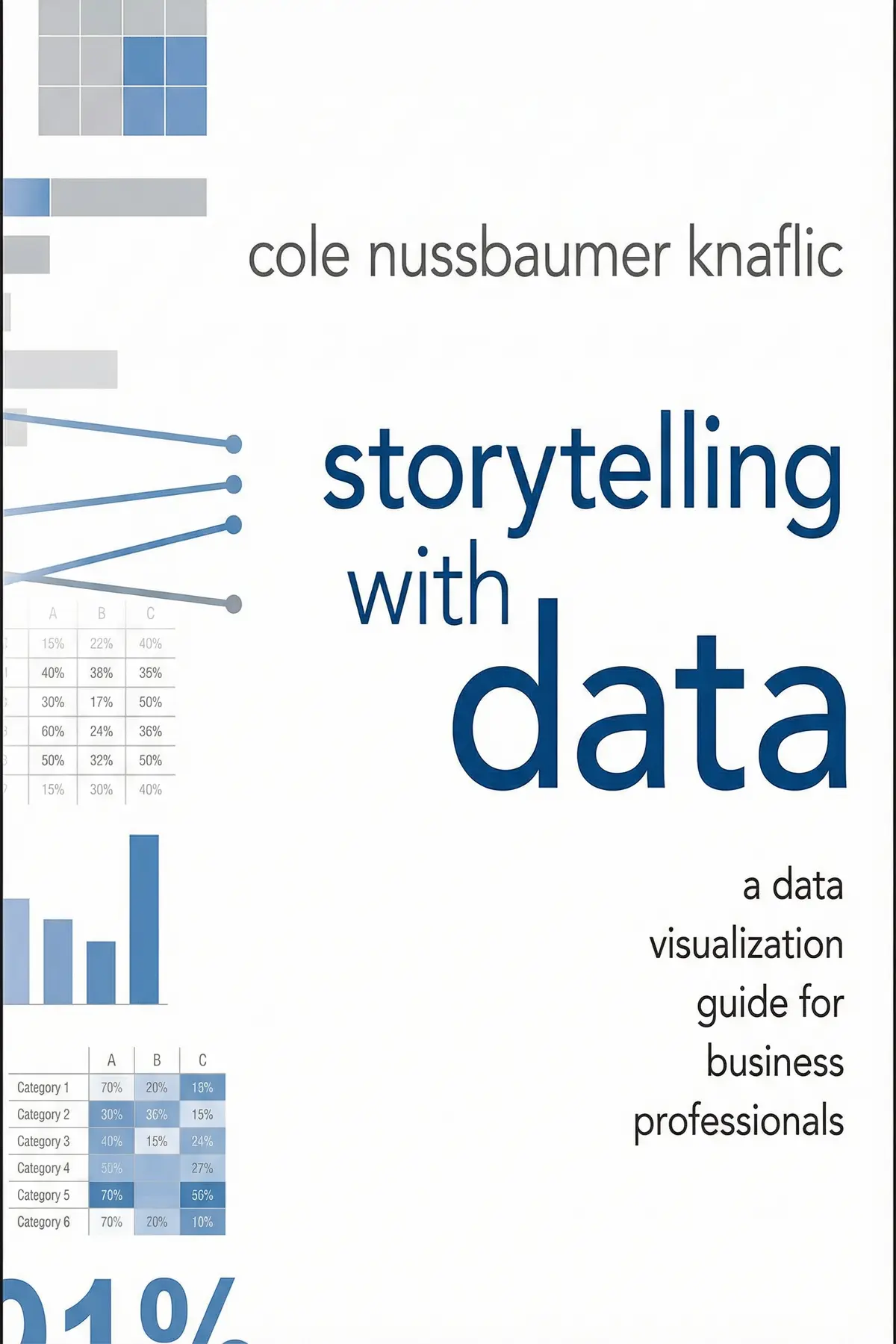
Table of Content
1. Introduction
1 min 13 sec
In our modern professional world, we are drowning in information but starving for insight. Most of us have the tools to generate charts—a few clicks in a spreadsheet and a graph appears—but very few of us have been taught the art of making those graphs mean something. We often fall into the trap of thinking that more data equals more persuasion, when in reality, a cluttered slide often leads to a confused and disengaged audience. This is where the gap between analysis and communication becomes a problem.
This summary explores a transformative approach to data visualization. It isn’t about making things look pretty for the sake of aesthetics; it’s about making things clear so that people can make decisions. We will walk through a process of understanding your audience’s needs, selecting the right visual tools, and applying design principles that respect the way the human brain processes information.
By the end of this journey, you’ll see your data not just as a collection of points and lines, but as the foundation of a narrative. You will learn how to guide your audience’s eyes to exactly where they need to look, how to strip away the distractions that hide your message, and how to structure your presentation so it sticks in the mind long after the meeting is over. Let’s dive into the strategies that turn business professionals into master storytellers.
2. The Foundation of Context
2 min 13 sec
Before you touch a single chart, you must answer three critical questions. Failing to define your audience and your goal can lead to a message that misses the mark entirely.
3. Choosing the Right Visual Vessel
2 min 04 sec
Not all charts are created equal. Discover why some visuals obscure the truth while others illuminate it, and learn the surprising power of simple text.
4. Reducing the Cognitive Tax
1 min 58 sec
Every element on your slide costs your audience mental energy. Learn how to identify and eliminate ‘clutter’ to make your message feel effortless.
5. Directing the Eye with Purpose
2 min 17 sec
Our brains process certain visual traits instantly. Master the use of size, color, and position to lead your audience through your data story.
6. Design for the Human Experience
2 min 08 sec
Good design is more than just looking good; it’s about functionality. Explore how ‘affordances’ and accessibility make your data understandable for everyone.
7. The Power of Narrative Structure
2 min 17 sec
Numbers tell us what is happening, but stories tell us why it matters. Learn how to wrap your data in a classic three-act structure to inspire action.
8. Conclusion
1 min 19 sec
The transition from simply displaying data to storytelling with data is a journey from being a passive reporter to an active influencer. Throughout this exploration, we have seen that the most impactful visuals are born long before a chart is ever drawn. They begin with a deep understanding of the audience and a clear definition of the desired outcome. We have learned that the secret to clarity lies in the ruthless elimination of clutter and a profound respect for the way the human brain perceives information through preattentive attributes and Gestalt principles.
By choosing the right visual vessel—be it a simple text statement or a clean bar chart—and applying intentional design affordances, you ensure that your message is accessible to everyone. But the true magic happens when you wrap that data in a narrative. By using the classic three-act structure of setup, conflict, and resolution, you turn dry statistics into a compelling human drama.
As you move forward, challenge yourself to look at your next presentation through the eyes of your audience. Ask yourself: Is the ‘Big Idea’ clear? Have I removed the noise? Am I leading the eye or just filling the space? When you master these techniques, your data will no longer just be a collection of numbers on a page; it will be a clear, persuasive voice that drives strategy, inspires confidence, and creates real impact in your professional world.
About this book
What is this book about?
Have you ever sat through a presentation where the slides were so packed with charts and numbers that you lost the message entirely? Storytelling with Data is designed to ensure you never create a presentation like that again. It moves beyond the technical mechanics of software like Excel to focus on the psychology of visual perception and the timeless power of narrative. The book argues that data visualization isn't just a technical skill; it is a critical communication tool that bridges the gap between raw information and human decision-making. By following a structured approach to design, you will learn how to identify the core message of your data, choose the most effective visual format, and strip away the unnecessary noise that creates mental fatigue for your audience. The promise of this book is simple but profound: you will learn how to make your data the star of a compelling story that resonates with stakeholders and leads to real-world results. Whether you are a seasoned analyst or a manager who rarely looks at a spreadsheet, these principles will help you communicate with clarity and confidence.
Book Information
About the Author
Cole Nussbaumer Knaflic
Cole Nussbaumer Knaflic is a data visualization expert and educator known for her ability to transform complex data into engaging visual stories. With a background in business analytics and experience working at Google, she has become a leading voice in the field of data storytelling. Her other books include the best-selling Storytelling with Data: Let’s Practice!, which provides hands-on exercises to develop visualization skills.
Ratings & Reviews
Ratings at a glance
What people think
Listeners describe this work as useful and enlightening, offering straightforward guidance and thorough case studies that turn it into essential material for analysts and management. Its approachable and digestible tone is paired with a wealth of visual aids showing practical applications. Listeners value the way it refines data visualization techniques, with one listener highlighting how well it boosts both understanding and memory.
Top reviews
Wanida
This book is an absolute game-changer for anyone who has ever felt overwhelmed by a massive Excel spreadsheet. Knaflic breaks down the art of data visualization into digestible steps that feel remarkably intuitive once you see them in action. I loved the emphasis on context; it’s not just about making a pretty chart, but about understanding what you want your audience to do. The 'before and after' examples are the highlight of the text for me. They demonstrate how small changes in color or alignment can drastically improve the clarity of a message. To be fair, some of the advice feels basic, but seeing it applied systematically makes all the difference in a professional setting.
Show moreFatima
Finally got around to reading this, and I’m kicking myself for waiting so long. As someone who works in management, I constantly see data being presented as a 'look at this' instead of a 'do this.' Knaflic’s background at Google really shines through in her practical, no-nonsense approach to business communication. She treats data visualization as a language rather than a chore. The chapter on decluttering alone justifies the purchase price, as it teaches you how to strip away everything that distracts from your core message. I’ve already started applying the 'Big Idea' concept to my weekly reports, and the feedback has been phenomenal. It’s essential reading for anyone who needs to influence decision-makers.
Show moreYaowaluk
Wow. This is the first technical book I’ve read that actually felt like a conversation with a mentor. Cole makes the complex world of data viz feel accessible without being patronizing. The way she dismantles 'default' Excel settings is both hilarious and deeply necessary for modern professionals. We are drowning in data but starving for insights, and this book provides the life raft. Look, you don't need to be a graphic designer to make impactful slides; you just need to understand how the human brain processes information. I particularly enjoyed the sections on Gestalt principles, which helped me realize why my previous charts felt so disorganized. It’s a must-read for my entire team.
Show moreChai
After hearing so much buzz about Cole Nussbaumer Knaflic, I had high expectations, and she delivered. Most people just export a chart and think their job is done, but this book proves that's just the beginning. The writing style is punchy and direct, making it easy to finish in a few sittings. I love how she highlights the 'so what?' factor that is so often missing from business presentations. You are forced to think about who your audience is and what they need to know. It has transformed the way I approach every single graph I create. If you want your work to actually be understood and acted upon, you need this book in your library.
Show morePatchara
This book should be required reading for every MBA student and data analyst on the planet. I’ve spent years making 'okay' charts, but now I understand how to make them persuasive and memorable. The transformation from the initial messy data dump to the final clean visual is like watching a magic trick. Knaflic’s advice on using color sparingly to highlight key takeaways is a simple tip that yields massive results. I also found the 'case studies' at the end to be very helpful for seeing how these rules apply across different industries. It’s practical, it’s visual, and it’s immediately useful. Stop making boring slides and start telling stories instead.
Show moreValentina
Direct and impactful. Cole doesn't waste time with fluff; she gets straight to the core of what makes a visualization work or fail. The logic is grounded in cognitive science, but she explains it in a way that anyone can grasp. I especially liked the focus on 'eliminating clutter.' It's amazing how much more powerful a graph becomes when you simply remove the borders and redundant labels. In my experience, most business friction comes from a lack of clarity, and this book solves that problem head-on. It isn't just about data; it’s about becoming a better communicator. I’ve recommended it to three people this week already.
Show moreRotjanee
Ever wonder why your colleagues seem to zone out during your monthly status updates? It might be because your slides are cluttered with unnecessary gridlines and labels that don't actually add value. Cole Nussbaumer Knaflic offers a clear roadmap for cutting through the noise to find the actual narrative. Truth is, I used to just slap a graph on a slide and call it a day. After reading this, I realize I was neglecting the most important part: the story. While the book focuses heavily on static charts, the principles of cognitive load and pre-attentive attributes are universally applicable. It's a solid 4-star read that I'll keep on my desk for reference.
Show moreMoo
Picked this up on a recommendation from my mentor and found the layout to be incredibly pleasing to the eye. It is clear that the author practices what she preaches regarding design principles and white space. I appreciated how she walked through the transition from exploratory analysis to explanatory storytelling. Personally, I think the book could have used a bit more variety in its chart types, as it sticks mostly to the basics. However, the focus on 'preattentive attributes' like color and size really helped me understand how to direct an audience’s gaze. It bridges the gap between raw data and actionable insight beautifully, even if it skips over the more complex interactive visualizations.
Show moreAna
Not what I expected given the massive hype surrounding this title in the data science community. Frankly, if you’ve spent any time reading Edward Tufte or Stephen Few, you’ve already encountered these concepts in much greater detail. The author spends a lot of time on what I would consider common sense, such as choosing the right chart type or avoiding 3D pie charts. It felt like a very long blog post stretched into a full-length book format. I was hoping for more advanced techniques or perhaps a deeper dive into the ethics of visual persuasion. If you're a complete beginner, you might find value here, but seasoned analysts should probably look elsewhere.
Show moreYuwadee
The chapter on storytelling was the high point for me, but the rest of the book felt a bit repetitive. Coming from a design background, I was looking for something that addressed interactive UI or complex infographics. Instead, this is very much aimed at the PowerPoint crowd in corporate settings. It’s not a bad book by any means, but it feels like it’s redefining usability principles that have existed for decades. Gotta say, the emphasis on 'the story' is great, yet I found the lack of ethical discussion concerning. How do we ensure we aren't manipulating the audience with these visual tricks? It’s a decent primer, but it lacks the depth of Alberto Cairo’s work.
Show moreReaders also enjoyed
AUDIO SUMMARY AVAILABLE
Listen to Storytelling with Data in 15 minutes
Get the key ideas from Storytelling with Data by Cole Nussbaumer Knaflic — plus 5,000+ more titles. In English and Thai.
✓ 5,000+ titles
✓ Listen as much as you want
✓ English & Thai
✓ Cancel anytime